“What on earth did you design?”, “No merchant is ever going to use this!”, “Merchants don’t think they have a problem in the first place!”, “Go ahead, explain your design thinking!”, “I don’t care how you handle it, but increasing usage cost is simply out of the question!”, “This is logic for you tech people to handle in the backend—don’t display it on the UI!” Yesterday, during an online interaction design review meeting, a front-line operations colleague roared like this in the call. Although I personally detest conflict and try to avoid it as much as possible, I lowered my heart rate and listened carefully to their feedback on the design draft. In reality, the root cause of the conflict can be summarized as: “product/design/tech didn’t stand in the user’s shoes when designing the product.”
As the saying goes, “no one rises early without a reward”—if immediate positive feedback isn’t provided, users won’t bother clicking or learning about auxiliary features. For example, when a merchant wants to list a product, just let them fill out the required sales-related fields. As for providing LLM-driven AIGC image features, they should either be embedded in the image search function or directly display several candidate results on the interface for the user to choose. Don’t provide a blinding “24K titanium alloy” flashy button that makes users click, enter a prompt, wait ages to generate an image, and then click confirm—complete with “like” and “dislike” buttons. As complex and high-end as this feature may seem, if it were you, would you actually use it?
Although I sympathize with the designer whose carefully crafted interaction got blasted, I think the operations colleague pointed out a critical issue. If it hadn’t been called out, even more labor costs would have been wasted down the line—adding up to a massive expenditure in person-days, R&D salaries, and opportunity costs. Besides, a time-consuming and terrible design is a desecration of everyone’s time and life (Jigsaw from Saw gives a thumbs-up: if you dare design like this again, he’ll kidnap you to play a game tonight). Previously, Elon Musk deleted code; now, the CEO of the Jovian platform deleted 70% of their codebase. Are the products we painstakingly build really frequently used by users? Are the features on the UI in the image below really necessary to use every day? Can they be abstracted, categorized, consolidated, or even packaged into automated code logic? Shouldn’t we spend our time and energy on core features that are truly frequently used?
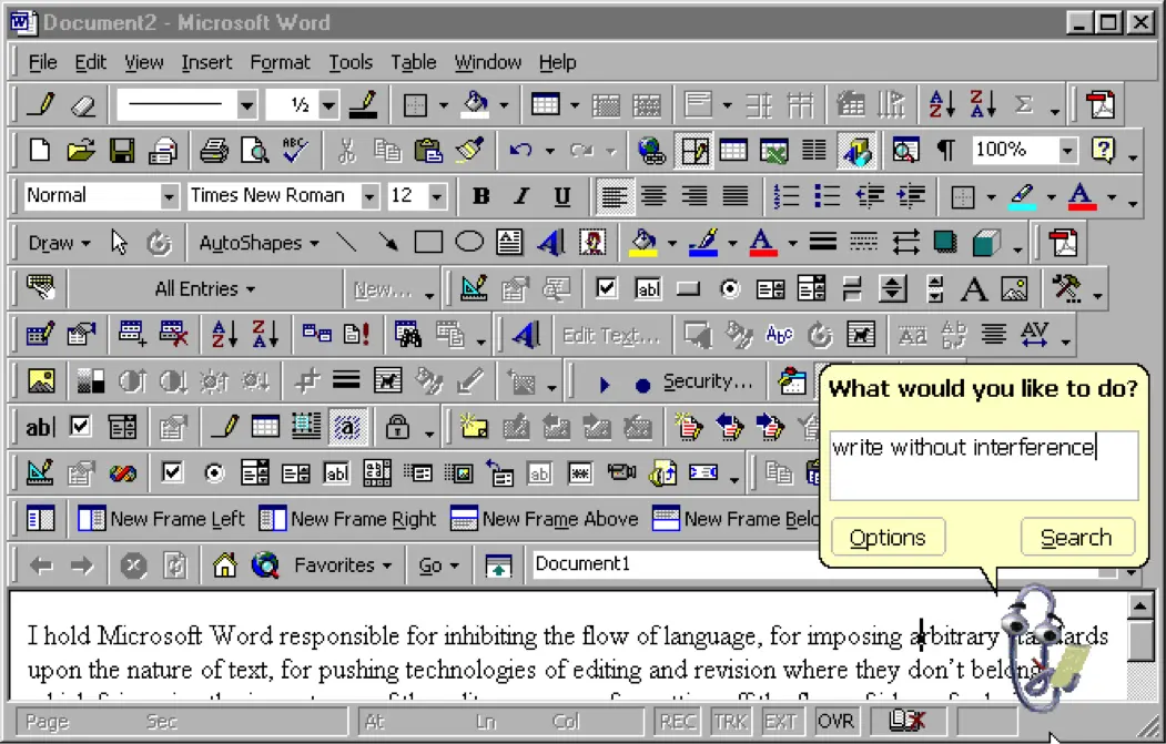
Although I am not a professional product manager or designer, I have independently designed multiple platforms and various productivity tools. I believe product design requires at least three perspectives:
The first perspective—the user perspective: users are lazy and goal-oriented. We need to think about what the user’s true needs are, whether the user’s UI operational flow is smooth, whether the new feature is something users frequently use, whether the new feature increases or decreases operational costs, whether users need to be incentivized to use it, where the entry point should be placed, whether it requires an extra step from the user, and whether options can be directly recommended for the user to choose from (just like in the workplace when encountering an uncertain issue, one should think it through and present the boss with a multiple-choice question on which, rather than asking how or what and waiting idly for an answer).
The second perspective—the operations perspective: operations staff are hardworking but hate repetition. We need to think about how to reduce operations workload, how to provide better batch management capabilities, and whether import/export features are easy to use. Which user data requires manual management by operations, can tech be used to predict or pre-fill it, and do the provided fields need frequent changes?
The third perspective—the technical perspective: engineers hope to achieve business results, get promoted, and get a raise. We need to think about where the value of a requirement lies, abstract features as much as possible into scalable and reusable modules, automate functions, and use the language and perspective of operations or users so that they understand the meaning, effectiveness, and impact of the features or operations. Finally, make each iteration ideally require only configuration updates or tool integrations, allowing yourself and upstream/downstream colleagues to finish work earlier.
For example, if I were to design a scheduling app, on the schedule entry interface, should I force users to select “Daily”, “Weekly”, “Monthly”, or even put verbs into a dropdown menu for them to choose? Doing so from a technical standpoint makes it easier to parse the reminder frequency, but do users care what tech thinks? I think users would likely just pick an input box to quickly jot down their entry and exit the app. To solve this problem, I could automate the parsing process and provide users with just a single input box. How the technical side parses the reminder frequency using complex features or algorithms is a backend matter that users don’t need to be aware of. Whether users modify the predicted result or not can also serve as positive or negative samples to refine the feature or algorithm model.
All in all, the birth of LLMs, product design, and technical improvements are all meant to free up human labor, boost productivity, and get people off work early to enjoy life—not to add even more friction to an already complicated operational workflow.